Discover the best fonts for dentist branding and learn how to build a trustworthy, minimalist font system that scales across video, social, and AI-generated visuals.
Fonts That Build Trust: Branding Fonts For Dentists
In branded content editing, most teams obsess over pacing, color grading, and sound design—and then pick a font in the last five minutes. Yet on a small smartphone screen, your typography often does more to shape brand perception than your transitions ever will.
For credibility-driven fields like dentistry, this is even more true. Patients are scanning ads, Reels, and landing pages, asking one question: "Do I trust this practice with my health?" The right font system can quietly answer yes before they read a single line of copy.
As part of our "Mastering Branded Content Editing: Tips, Tools & Trends" series, this guide breaks down the fonts we're seeing work incredibly well for modern dental brands—plus how to combine them, animate them, and even generate on-brand visuals with AI. You'll walk away with a practical framework you can apply to any healthcare or professional services brand, not just dentists.
Why Fonts Matter So Much In Dental Branding
In performance-focused content, creators track watch time, click-through rate, and conversion. But for healthcare and dentistry, there's another invisible metric at play: perceived trustworthiness.
Typography shapes that perception in three key ways:
-
First impression on mobile
When your ad, Story, or TikTok appears, users register tone before message. Rounded, clean sans serifs signal care and clarity. Sloppy scripts and novelty fonts signal chaos or amateurism. -
Cognitive ease
Simple, highly legible fonts reduce effort. When information feels easy to process, audiences subconsciously rate the source as more competent and honest. This is crucial when explaining treatments, pricing, or payment plans. -
Consistency across formats
A strong font system scales from a logo on a sign to lower thirds in a YouTube explainer. In branded content editing, having dependable typography makes it easier to keep every video, carousel, and email visually aligned.
For dentistry brands, the winning formula is usually: minimalist, bold, and trustworthy—exactly how the original font list we're expanding on was curated.
A Curated Font Stack For Modern Dental Brands
Below is a breakdown of the fonts mentioned in the original case study, plus how you might use each one in real-world branded content editing.
Note: These are conceptual recommendations, not legal or licensing advice. Always check font licenses before use.
1. Sweet Sans Pro – Friendly, Premium Clarity
Best for: Logos, primary headings, clean social templates
Sweet Sans Pro has a warm, geometric feel: modern but not cold. For a dental clinic that wants to feel premium yet approachable, this is a strong candidate for:
- Practice logo and wordmark
- YouTube thumbnail headlines
- Big, bold statements in brand videos ("A brighter smile in 60 minutes")
Editing tip: Pair Sweet Sans Pro with soft gradients, white space, and slow, confident motion graphics. Let the letters breathe—avoid cramming text into small areas.
2. Forma DJR Micro – Micro-Size Legibility
Best for: Captions, disclaimers, app UI, lower-thirds on small screens
As the name suggests, this font is engineered for clarity at tiny sizes, especially on digital displays. In dental content, that's useful for:
- On-screen disclaimers ("Results may vary", "Not a substitute for professional advice")
- Subtitles on Stories and Reels
- UI elements in patient portal demos or explainer app mockups
Editing tip: Use Forma DJR Micro for small informational text while keeping headers in a bolder, more expressive font. This creates a clear visual hierarchy without sacrificing legibility.
3. Brother 1816 – Robust And Versatile
Best for: Brand-wide typography system
Brother 1816 is a highly adaptable sans serif that works for:
- Website body copy
- Email newsletters
- Slide decks and educational PDFs
- Lower thirds and callouts in educational videos
Editing tip: In branded video, keep titles at a heavier weight (SemiBold/Bold) and body text at Regular/Book. This makes it easy to scan and keeps your layout consistent across formats.
4. Bradley Hand – Human Touch In Small Doses
Best for: Accent text, signature notes, personal touches
Handwritten fonts can instantly add warmth, but overuse makes a brand feel unprofessional. In dentistry, Bradley Hand works well when used sparingly for:
- Doctor's "signature" on testimonial cards
- Small annotations over before/after photos ("2 months", "whitening only")
- Callouts in short-form video ("My tip:" or "Patient favorite")
Editing tip: Use Bradley Hand as an overlay accent in motion graphics. Animate it with light, organic motions—like a subtle write-on effect—to reinforce the feeling of a personal note from the dentist.
5. Loretta Display VF – Character With Control
Best for: Hero headings, campaign slogans, seasonal promotions
Loretta Display VF (a variable font) gives you expressive display styling with fine control over weight and width. This is ideal for:
- Big homepage hero text ("Smile with confidence")
- Campaign-specific branding (holiday whitening offers, back-to-school checkups)
- Short title cards in brand films
Editing tip: Because Loretta Display is more stylized, keep usage minimal and avoid long sentences. Think 2–4 word headlines, surrounded by generous white space.
6. Spalla – Strong, Bold Statements
Best for: Thumbnails, offers, punchy CTAs
Spalla is bold and assertive, perfect for high-impact text like:
- "Free Consultation" on ads
- Price or discount overlays in promo videos
- Carousel covers for social campaigns
Editing tip: In branded content editing, design your hierarchy so Spalla appears only for the most important on-screen message. This prevents visual noise and keeps impact high.
7. Proxima Nova – The Workhorse Sans Serif
Best for: Everything, if you must pick one font
Proxima Nova is ubiquitous for a reason: it's neutral, legible, and scales well across digital platforms. If your team wants one font that can handle almost all branded content needs, this is a safe and flexible choice.
Common uses:
- Site and app UI
- Long-form educational blog posts
- On-screen explainer text, captions, and lower thirds
Editing tip: Because it's so common, pair it with unique color grading, icon style, or motion language to avoid looking generic.
8. Superior Title – Editorial Authority
Best for: Thought leadership and educational content
Superior Title has an editorial feel that can make your dental brand look more like a health publisher than a local practice. Consider it for:
- Titles of in-depth treatment guides
- Thumbnail headlines for long-form YouTube content
- Printed brochures and magazines in the waiting room
Editing tip: When used in video, combine Superior Title with documentary-style color grading and slower pacing to reinforce authority and depth.
9. Roca – Soft, Approachable Character
Best for: Pediatric or family-focused practices
Roca is often softer and more rounded, giving a friendly, playful tone without feeling childish. That makes it ideal for:
- Family dentistry or pediatric practice branding
- Child-focused campaign visuals ("First dentist visit made easy")
- Poster and signage in kid-friendly areas of the clinic
Editing tip: In branded content, pair Roca with brighter color palettes, softer shapes, and gentle sound design to reinforce a calm, child-friendly experience.
Building A Dental Brand Font System (That Editors Can Actually Use)
Choosing fonts is only half the battle. The other half is turning those choices into a usable system for all your editors, designers, and marketers.
Step 1: Define Roles For Each Font
Instead of randomly swapping fonts in and out, assign roles:
- Primary brand font: Headlines, main UI text (e.g., Sweet Sans Pro or Brother 1816)
- Secondary font: Body copy and paragraphs (e.g., Proxima Nova)
- Accent font: Handwritten or display touches (e.g., Bradley Hand or Loretta Display VF)
Document these roles in a one-page brand sheet that editors can reference while cutting video or designing posts.
Step 2: Lock In Hierarchy And Sizes
Create a basic type scale that works across web, print, and video:
- H1: Hero headlines, 48–72px (scaled appropriately in video safe zones)
- H2: Section titles, 32–40px
- H3: Callouts / sidebars, 24–28px
- Body: 16–18px (minimum 14px for captions on mobile)
In video templates, build text styles so editors can apply headings and captions in one click instead of guessing each time.
Step 3: Align Typography With Motion And Sound
Typography is one layer of branded content editing; motion and audio are the others. Aim for alignment:
- Minimal, clean fonts → slower transitions, softer sound design, natural color grading
- Bold, high-impact fonts → punchier cuts, stronger accent sounds, higher contrast
For a dental brand, most content should lean toward calm and trustworthy, with bolder motion reserved for offers and time-sensitive campaigns.
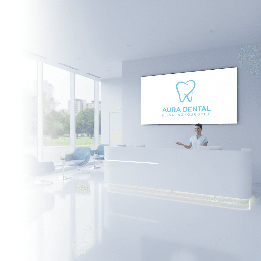
Using AI To Generate On-Brand Visuals With Your Fonts
The original case study hinted at using AI to create images "like these" with a simple prompt. That's a powerful workflow for content creators trying to scale branded content without compromising consistency.
Here's how to integrate AI into your typography-led branding process.
1. Start With A Clear Brand Style Prompt
Before you generate anything, define your visual language in words. For example, for a modern dental brand:
- "Minimalist, white and soft blue color palette"
- "Clean, clinical but welcoming"
- "Natural smiles, bright but not overexposed lighting"
- "High-end, tech-forward dental equipment background"
This becomes the backbone of every AI image prompt you use.
2. Design Templates Once, Reuse Often
Create a few master layouts in your editing or design tool:
- Testimonial card template
- Before/after comparison template
- Quote + doctor photo template
- Offer/promotion template
Then, for each new campaign:
- Generate background imagery with AI that matches your brand style.
- Drop that imagery into your templates.
- Apply your defined font styles (H1, H2, Body, Accent) consistently.
This workflow keeps creativity high while locking in brand consistency.
3. Use AI To Explore Font Pairings—Then Decide As A Team
AI tools can quickly mock up:
- Different font combinations for logos
- Title card options for your video series
- Alternate layouts for an upcoming campaign
Treat these outputs as idea starters, not final brand decisions. Review them as a team, pick what feels most aligned with your brand values, and then codify those choices in your brand style guide.
From Fonts To Full-Funnel Trust
Within this Mastering Branded Content Editing series, we've talked about pacing, color, and sound. Typography is the bridge that connects all of that to how your brand feels in a split second—especially for dentistry brands that must communicate safety, expertise, and warmth immediately.
The fonts above—from Sweet Sans Pro and Proxima Nova to characterful options like Loretta Display VF and Roca—give you a starting palette. The real magic happens when you:
- Assign each font a clear role in your system
- Build reusable templates for video and social content
- Use AI to generate visuals that match your brand's typography and tone
If you're serious about scaling your branded content, don't treat fonts as an afterthought. Treat them as a strategic lever for trust.
Which font style best matches the story you want your dental brand to tell—and how will you bring it to life in your next edited piece of content?