Learn how to turn minimalist, bold, trustworthy fonts into a full typography system that strengthens your branded content and speeds up AI-powered production.
Font-First Branding: Typography Tricks For Standout Content
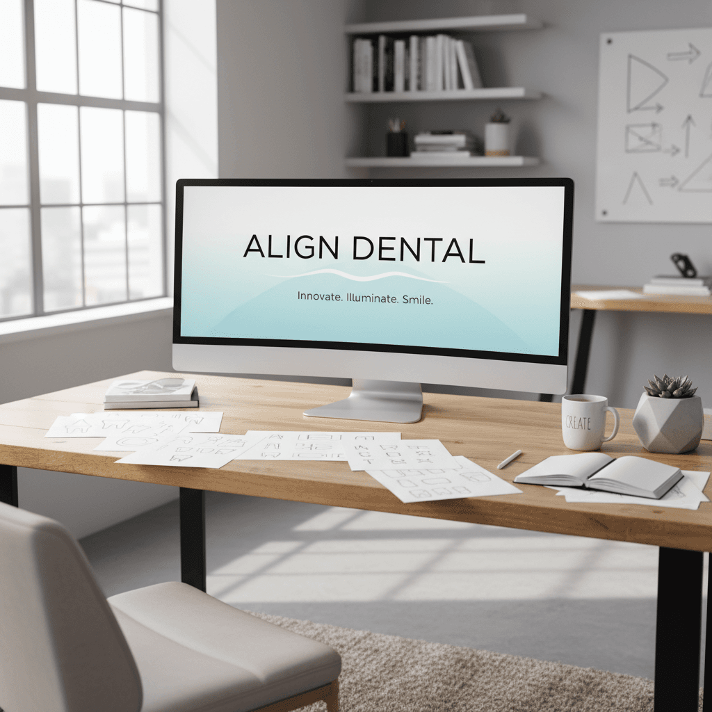
In every piece of branded content you publish—whether it's a short-form video, a carousel, or a landing page—your typography is doing as much storytelling as your script or color grading. In dentistry, healthcare, and other trust-based industries, the right font can be the difference between "I'll think about it" and "I'm booking now."
As part of our "Mastering Branded Content Editing: Tips, Tools & Trends" series, this guide zooms in on one often-overlooked pillar of visual storytelling: fonts. The original inspiration was a simple list of typefaces used in fictional dental brands—Sweet Sans Pro, Proxima Nova, Bradley Hand, and more. We'll transform that list into a complete, practical framework for choosing and using fonts in your branded content, especially when AI tools are part of your workflow.
You'll learn how to pick fonts that signal trust, how to pair them for video and social assets, and how to use AI to generate on-brand visuals faster—without losing creative control.
Why Fonts Matter So Much In Branded Content Editing
When we talk about mastering branded content editing, we usually jump straight to pacing, color grading, and sound design. But if your typography is off, everything else feels off—no matter how cinematic the grade or how punchy the cut.
Typography = Instant Brand Perception
Within the first second of viewing a piece of content, audiences subconsciously ask:
- Is this brand credible?
- Is it premium or budget?
- Is it calm and caring, or bold and disruptive?
Your font answers those questions before your copy does. For dentistry and other professional services, the stakes are even higher: people look for clean, minimalist, trustworthy typography that calms anxiety and signals competence.
Good branded content editing doesn't just arrange visuals—it orchestrates emotion, and typography is one of your strongest instruments.
Fonts As A System, Not A Single Choice
Thinking in terms of a "favorite font" is a great starting point, but in professional content editing you're building a type system:
- A hero font for logos and titles
- A clear, legible font for body copy and captions
- Accent fonts for callouts, lower-thirds, or key frames in video
The fonts mentioned in the original list—like Sweet Sans Pro, Proxima Nova, Superior Title, Roca, Loretta Display VF, Bradley Hand, Brother 1816—all lend themselves to specific roles in that system. The magic comes from how you combine them.
The Psychology Of "Minimalist, Bold, Trustworthy" Fonts
The original post described these fonts as minimalist, bold and trustworthy—a perfect combination for dentistry, where you want professional confidence without feeling cold or clinical.
Minimalist: Calm, Clean, And Modern
Minimalist fonts are often:
- Sans-serif
- Geometric or humanist
- Evenly spaced, with clear letterforms
Think of Sweet Sans Pro, Proxima Nova, Brother 1816. These fonts are ideal for branded content editing because they:
- Read well on mobile at small sizes
- Layer cleanly over video without visual noise
- Feel current without being trendy for only one season
In your edit, that might look like:
- Using Proxima Nova for social media carousel body text
- Using Sweet Sans Pro for lower-thirds and on-screen labels in explainer videos
Bold: Confident, But Not Shouty
"Bold" doesn't just mean heavy weight—it means visual confidence. Fonts like Roca, Superior Title, Spalla, Loretta Display VF make strong statements in titles and hero frames.
Use bold, display-oriented fonts for:
- Video opening frames ("Your New Smile, In One Visit")
- Thumbnail titles
- Section headers on landing pages
Balance that boldness with lots of white space and a minimalist secondary font so your content still feels premium and controlled.
Trustworthy: Human, Honest, Reliable
Trustworthiness comes from consistency and legibility, but sometimes a subtle human touch helps. That's where something like Bradley Hand might be used sparingly:
- A handwriting-style note in a testimonial graphic
- A signature on a "Doctor's Tip" card
In branded content editing, a "handwritten" overlay can feel personal—but only if the main system stays clean and professional.
A Practical Typeface Stack For Dentistry & Healthcare Brands
Let's turn the font list into a plug-and-play type system you can actually use in your content.
Primary Typeface: Modern, Minimalist Sans
Choose one of:
- Sweet Sans Pro – Friendly, approachable, clean
- Proxima Nova – Versatile workhorse, great for UI and social
- Brother 1816 – Modern with character, good for headlines
Use for:
- Logos and logotypes
- Headings in carousels and landing pages
- Main typography on video titles and lower-thirds
Secondary Typeface: Body Copy & Long-Form
You can often stick with the same family (e.g., Proxima Nova Regular/Light) and vary weight and size for hierarchy. Or pair with a simple serif for a more editorial feel.
Use for:
- Website paragraphs
- Social captions baked into graphics
- FAQ overlays in explainer videos
Accent Typeface: Character Without Clutter
This is where Loretta Display VF, Roca, Spalla, Superior Title come in. They're best used in small doses:
- Big promo headlines ("Holiday Whitening Event")
- Section titles in PDF guides or lead magnets
- Highlight cards in brand storytelling videos
Handwritten Touch: Emotional Moments
Fonts similar to Bradley Hand should be used like seasoning, not the main dish.
Use for:
- "From Dr. Smith" signatures
- Kids' testimonials or quote cards
- Occasional notes in patient journey content
Avoid:
- Setting long paragraphs in handwriting fonts
- Relying on them for core brand messaging
How To Use Fonts Effectively In Video & Social Editing
Picking fonts is step one. Step two is deploying them well across your edited content so everything feels cohesive—no matter the platform.
1. Build A Simple Typography Style Guide
Before you even open your NLE or design tool, define:
- H1 / Title: e.g., Roca, 72–110 pt, all caps, tight line spacing
- H2 / Subtitle: e.g., Sweet Sans Pro Semibold, 40–52 pt
- Body: e.g., Proxima Nova Regular, 18–24 pt
- Accent / Script: e.g., Bradley-style hand, only for 3–4 word callouts
Document this in a single page that editors, designers, and copywriters share. This is core to brand consistency—and makes your AI tools much more effective when you start automating.
2. Design For Motion: Typography In Video Edits
In branded content editing for video, type needs to work in motion and at speed.
Keep in mind:
- Hierarchy: One message per frame. Make the key phrase the largest.
- Safe zones: Keep text away from the very edges for mobile viewing.
- Contrast: Light text on dark overlays or vice versa; avoid busy backgrounds.
- Duration: Viewers should read everything at least twice at normal pace.
For dentistry brands, a clean style might look like:
- Title: Sweet Sans Pro Bold, centered, white on soft blue gradient
- Subtitle: Proxima Nova Regular, smaller, left-aligned
- Callout: Accent font for single words like "Free" or "Now"
3. Adapting Fonts Across Platforms
Your typography system should scale across:
- Short-form video: Big, bold titles, minimal body text
- Stories/Reels: High contrast, short phrases, consistent positioning
- Carousels: Clear hierarchy from slide to slide using the same fonts and sizes
- Landing pages: The same families, adapted for web reading
This is how your brand becomes instantly recognizable—even without a logo present.
Using AI To Generate On-Brand Visuals And Typography
The original post hinted at something powerful: using AI to create brand visuals that match your typography choices. In 2025, this is one of the biggest productivity boosts in content production.
1. Train AI On Your Typeface System
Whether you're using AI design tools, video templates, or image generation:
- Upload or specify your primary and secondary fonts
- Define default sizes for titles, subtitles, and body
- Set rules like: "Never use handwritten font for paragraphs" or "Accent font only for main headline"
By combining your style guide with AI templates, you can:
- Generate consistent thumbnails from a single prompt
- Auto-apply your typography to short-form video templates
- Batch-produce A/B variants of headlines with your core fonts
2. Prompting AI For On-Brand Visuals
When you want visuals that feel like your brand, reference your typography in your prompts. For example:
"Create a clean, minimalist dental clinic scene with calm lighting, matching a modern sans-serif, friendly typography aesthetic. Emphasize trust and comfort."
Even if the AI can't literally render your licensed font, it will aim for the vibe—clean, modern, trustworthy—which you then refine in your editing software by overlaying your actual brand fonts.
3. Speed Without Sacrificing Control
AI can:
- Mock up 10 layout options with your font system in seconds
- Suggest alternative sizes or weights for better hierarchy
- Auto-generate different aspect ratios (9:16, 1:1, 16:9) while keeping text styles intact
Your job as a content editor shifts from drawing every layout from scratch to curating and refining. That's where your judgment about brand, audience, and storytelling remains irreplaceable.
Turning Font Choices Into A Lead-Generating Brand System
Choosing a "favorite font" is fun. But in a serious marketing and content strategy, typography becomes a lead-generation asset.
When your fonts are consistent across video, social, and web:
- Viewers recognize you faster in crowded feeds
- Your content feels more premium, justifying higher-priced services
- Your messaging looks trustworthy, which is vital for healthcare and dentistry
To put this into practice:
- Pick your core stack from fonts like Sweet Sans Pro, Proxima Nova, Brother 1816, plus one accent and optional handwritten style.
- Build a one-page typography guide for your team and AI tools.
- Apply it across your edited content—thumbnails, Reels/TikToks, carousels, landing pages.
- Let AI handle the repetition so your team can focus on storytelling, pacing, and strategic offers.
As you continue through the "Mastering Branded Content Editing: Tips, Tools & Trends" series, keep this in mind: every advanced technique—whether it's transitions, color grading, or AI-driven workflows—sits on top of a clear, consistent visual language. Typography is one of the fastest, most controllable levers you have.
Which fonts will define your next season of content—and what story will they tell about your brand before a single word is read?